“Herbs of the Orient” conjures fragrant markets, slow-brewed remedies, centuries-old recipes, and a promise: natural wellbeing tuned to ancient wisdom. Designing a brand around that promise means balancing authenticity and modernity, honoring cultural roots without resorting to tired clichés, and creating visual and verbal systems that make the product desirable on a crowded shelf (and thumb-stopping online). Below is a full, practical brand-design playbook to shape Herbs of the Orient into a memorable, trustworthy, and beautiful brand.
Brand essence: what the name should mean visually and emotionally
Core promise: Hand-harvested, traditionally inspired botanicals delivered with modern transparency and efficacy.
Tone of voice: Warm, knowledgeable, a little poetic but never mystical in a way that feels vague. Think: “We know these plants. We source them with respect. We help you feel better.”
Primary audience: Wellness seekers age 25–55 who value natural ingredients, sustainability, and beautiful packaging—people who buy both for ritual and results. Secondary audience: gift buyers and boutique retailers.
Keep the brand essence at the center of every design decision: packaging, website, photography, copy, and social presence should all answer the question, “Is this true to the promise of herbs + heritage + modern clarity?”
Visual identity: a framework that feels both eastern-rooted and contemporary
Logo
- Primary mark: A clean, slightly organic wordmark with a companion emblem. Use a serif or transitional serif with modest calligraphic influence for warmth and credibility. Avoid heavy decorative scripts that are hard to read at small sizes.
- Emblem idea: A simplified mortar & pestle or a stylized sprig (e.g., a bay leaf or tea leaf) formed into a circular seal. The emblem should work as a social avatar and a seal-of-authenticity on packaging.
- Lockups: Provide horizontal and stacked versions; full-color, single-color (for embossing), and reversed treatments.
Color palette
- Primary: Deep herbal green (trust, growth), warm umber or tea brown (earth, craft).
- Accent: Muted saffron or turmeric yellow (heritage and visual warmth), soft jade or teal (freshness).
- Neutrals: Off-white paper tone, charcoal for type, pale parchment for secondary backgrounds.
This palette should read as natural and premium—avoid neon or saturated brights that clash with the brand’s botanical integrity.
Typography
- Headline: Elegant serif with high legibility and subtle personality.
- Body: Clean sans-serif for readability across packaging and web.
- Accent: A humanist italic or small-caps for ingredient callouts and batch codes.
- Ensure web fonts closely match print fonts to preserve brand cohesion.
Photography & Illustration
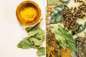
- Photography style: Warm, natural light; shallow depth of field; hands-on moments (hand-harvesting, pouring tea, mortar & pestle action). Avoid heavy retouching—textures matter.
- Illustration style: Botanical line drawings with occasional watercolor washes. Use these sparingly as pattern elements or ingredient spot-illustrations, not as the primary visual.
Packaging design: ritual + clarity
Packaging must communicate heritage, ingredient transparency, and modern convenience.
Structural choices
- Primary SKUs: Tea tins, herb jars, tincture bottles, sachet pouches.
- Materials: Recyclable metal tins, glass jars with natural cork or matte black caps, kraft paper pouches with compostable liners where possible.
- Labels: Use tactile, uncoated paper labels with letterpress or matte finishes for a premium, earthly feel.
Front-of-pack hierarchy
- Brand name + emblem
- Product name (e.g., “Calming Night Blend”)
- One-line benefit (e.g., “Promotes restful sleep — non-habit forming”)
- Net weight / volume and certification icons (organic, cruelty-free, etc.)
Back-of-pack storytelling
- Short provenance note: where the main herb is sourced and why it matters.
- Brewing / usage instructions in simple steps.
- Batch number and “small-batch” note to create craft credibility.
Sustainability cues
Call out recyclability, refill programs, or compostable options clearly—eco-conscious buying is a selling point.
Product naming & taxonomy
Create consistent naming rules that are evocative and functional:
- Hero name pattern: [Benefit] + [Type] → “Calming Night Blend (Herbal Tea)”
- Ingredient-first pattern for signature single-herb lines: “Oriental Mint — 100% Leaf”
- Collection names: “Rituals” (daily), “Respite” (sleep & relaxation), “Revive” (energy & digestion)
Maintain an internal glossary so marketing, labels, and web copy use the same terms for ingredients and benefits.
Brand voice & messaging guidelines
- Headline voice: short, purposeful, benefit-led. Example: “Sip Calm. Sleep Well.”
- Body copy: conversational, informative, light on jargon. Avoid overpromising (no medical claims).
- Story copy: one-paragraph origin story on site: why the brand was founded, sourcing philosophy, and a human face (founder or herbalist).
- Microcopy: clarity-first—ingredient lists, dosing, and cautions must be explicit and easy to scan.
SEO tip: weave the keyword phrase Herbs of the Orient brand design naturally into the site’s “About” page, a brand story blog post, and the design case study page.
Digital presence — website & social
Website
- Homepage: hero image + succinct value statement; primary CTAs for Shop and Learn.
- Product pages: large photos, ingredient callout, brewing/use instructions, reviews, related products.
- Content: blog with recipes, herb guides, and “how to use” tutorials. These drive organic traffic and establish authority.
- Accessibility: high contrast text, alt text for all images, keyboard navigation.
Social
- Instagram: focus on rituals—short Reels showing brewing moments, ingredient sourcing, before/after rituals.
- Pinterest: mood boards around wellness rituals and gift guides.
- Email: nurture sequences: welcome series, education on herbs, seasonal blends.
Retail & merchandising
- Shelf strategy: strong emblem and clean color band so the tins are recognizable at a glance. Use short benefit statements for quick decision-making in-store.
- POS materials: recipe cards, mini-sachets for sampling, and a small herb story card about sourcing.
- Bundling: curated “Ritual Kits” for sleep, digestion, or immunity to increase average order value.
Brand launch & rollout checklist
- Finalize logo and color system (primary + accents).
- Create packaging prototypes for top 3 SKUs.
- Build a simple e-commerce site with product photography and collection pages.
- Write 5 seed blog posts (e.g., the origin story, herb spotlights, brewing guides).
- Prepare 10 social assets + 3 short videos for launch week.
- Set up email automation: welcome series + first-purchase discount.
- Reach out to 10 local retailers for consignment/sample shelf space.
- Implement sustainability messaging and recycling/refill program copy.
- Collect early user feedback and iterate on packaging copy and product sizes.
Avoiding pitfalls & cultural sensitivity
- Don’t appropriate: If the brand references specific cultural traditions, credit the source respectfully and accurately. Avoid generic “Orient” tropes that flatten diverse cultures—use specific provenance when possible.
- Avoid pseudo-science: Be clear about benefits without medical claims. Use language like “traditionally used for…” or “may help support…”
- Representation: Feature diverse people and authentic contexts in imagery rather than stereotypical costumes or props.
Measuring success: KPIs for brand design
- Brand awareness: social engagement, organic search volume for brand name.
- Conversion: product page conversion rate, cart abandonment rate.
- Repeat purchase: 30/60/90-day repurchase rates.
- Retail uptake: number of stores carrying product and sell-through rates.
- Customer sentiment: reviews mentioning trust, packaging quality, and perceived efficacy.
Quick moodboard directions (for your designer)
- Textures: unbleached paper, raw linen, hand-thrown ceramics.
- Photos: hands, herbs in natural light, steam rising from cups.
- Shapes: rounded, soft-edge capsules and jars; circular emblems.
- Words: “handcrafted”, “small-batch”, “heritage”, “transparent sourcing”.
Final note
Designing the Herbs of the Orient brand is about crafting a modern ritual: one foot in ancestral knowledge, one in transparent modern practice. Keep visuals tactile and honest, let product efficacy speak through clear copy and ingredient provenance, and build an identity that feels like a trustworthy neighbor—calm, helpful, and beautiful. If you want, I can now create: a logo concept sketch, a packaging mockup template, or a 30-day social launch calendar tailored to the brand’s first three SKUs. Which would you like next?